Thursday, 1 December 2011

Evaluation- what have you learned from your audience feedback?

 
The first person that I interviewed is Sarah Tye. She fits the target audience because she is 17 and she is female. She is also student which falls into the socio-economic grouping E, but because she lives with her family then she has the money to go to the cinema and enjoys films.
The next person i interviewed was Becky Tye who is 20 yrs old and another female. She also fits the target audience as my target audience is of a wide group. She is also a student so again, falls into the socio-economic grouping E, but because she has a part-time job and lives with her family, she has a good income to go and watch films at the cinema.
We then asked Zak, who is 18 and male. He too is a student and lives at home with his parents, so has the money to watch films and enjoys watching short films. Even though are target audience was originally females, we wanted to know if our short film had the penumbra effect. The penumbra effect is the unintended audience that enjoy or purchase the object or film.


We then asked them about the improvements that could of been made to our film. I learned that yes the music could of been smoother when changed between songs, but we simply didn't have the technology as someone who has alot of money to make a film. I have also learnt that i can make a decent film that people actually enjoy!

Final film of Forgetting


This my final short film. I changed some of it by adding some more transitions to make it run smoother, so the change between scenes were less aggressive.

Final review page for 'Forgetting'

1

Wednesday, 30 November 2011

Final Poster of 'Forgetting'.

Here is my final poster for our film, 'Forgetting'.


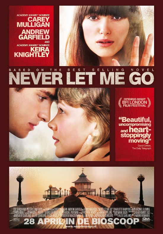
As you can see from previous posts and my final poster, it was based on this 'Never 


i
Let Me Go' poster. I liked the layout and the  idea of the separate boxes with different pictures and the difference 


of close ups and mid shots used. 


I liked the shade of red used in the background and tried to create a deep shade


of dark browny red with an effect of it being lighter in the middle then getting darker as it went to the edges.

Page Review

This is my review page. It was going to be my final review page until i realised that i hadn't added some conventions that i was going to use. Like i was going to use a pull quote where some of the text is made into a bigger font and moved between the columns.

Call Sheet

This is a call sheet that tells the talent and us what we were filming and when. We mainly did it in our media lessons, but as you can see we also did filming outside of school. Using a call sheet is a good idea as it was alot easier then running around trying to find them. 

Rough draft of my review page.

Here is my rough draft on the review page i have to do as one of the ancillary tasks. As you can see the layout is very much the same as my researched review pages.  Here i am following many conventions of a review page as the text will be in columns with one picture at the top of the page like my reasearched review pages. In the top left hand corner there will be the logo and 'film review' very much like alot of existing film review pages.

Sunday, 27 November 2011

Research on ancillary task of producing a film review from a magazine.


Looking at 'flipside' which is a review magazine and these reviews from various other magaines, they all follow the same conventions of that to a music magazine. For example, they each use a column grid for the text and have one big picture either at the top or the side of the text. Some use bigger text as a sub-heading in the middle of the review. This catches the readers eye so we may use this in our review.

Other changes.

We have decided to add abit more to our storyboard and add a graphic shot, from when she gets hit by the car to her lying in the coma. We have put all the bad memories in black and white, and the happy memories we have given brighter colour to them. We also are using different transistions from one scene to another to keep it more exciing and not to let it get boring due to the transitions.

Recce changed

We have decided to changed the recce and we filmed it at my house, so it looked alot more like home then using a home looking reception and the quality would be much better. The lighting we could ajust more easily as there was a dimmer switch, so we could change the light without having to move around too much. Here is now a picture of the dining room that i used to film. We have kept the locations, for when our talent is pushed down the stairs and when sh is hit by the car.

ancillary tasks- draft

Ashleigh and i have decided to make different posters using the same images. We have deided to make different posters as we both have different ideas and variety of film posters is alot. I have based the poster that i am doing on the 'Never Let Me Go' poster, which is shown down below. I like that they have used different pictures to get the story across more. I also really like the layout of the poster. I will follow the conventions of having a review from a newspaper and having the names of the talent and crew at the bottom. I wanted the background to be a muddy red, but when it was finished, it did not look right, so i changed the background colour.

I had another idea of a film poster, so the draft is shown below. I didnt really like this one as it was just one big picture, however it followed more conventions then the 'Never Let Me Go' poster as alot of posters i have looked at have one picture.


Here is the poster that i based my own poster on. As you can see i have used the idea of the boxes and different pictures with the title a third of the way down the page.

Wednesday, 9 November 2011

How am i creative?

In todays lesson we were talking about how creative we are, as we are making our own short films or music videos.  The ways i am creative are:reading books.
lyrics in songs.
certain plays and play writers like Sarah Caine.
I've been doing drama for 10 years so my creative side comes quite naturally as i use it a lot for performances.
My friends as we are all random people and say strange things!

Practice shots.

These are some practice of our practice shots with the people we are going to use. I am going to do some filming on saturday to get most of the scenes right.

Tuesday, 8 November 2011

Little changes

We have now decided to change the person who is playig the main character as the original choice is very hard to find and get hold of. Me and Ashleigh have decided to use piao music throughout untill we get to the car scene where playing will be 'Girlfriend in a Coma' by Joshua Radin. We did this as people started to think we were doing a music video not a short film. We are also changing some parts of our recce, where they will now be filmed at my house. We have had to do this for time frame and quality of looking.

Wednesday, 19 October 2011

Recce

The pictures of the stairs are where we are going to have the scene where our talent gets pushed down the stairs for the bad memories. Obviously, we are not going to actually push her down the stairs because of health and safety reasons, we will use epic editing!


This picture of the tree and grass is going to be 'The Park' where our talents will be having a nice time for one of the good memories.


This picture is of the road where our talent will get hit by the car.


This picture of the sofa in our school reception is going to be their sitting room, where he will propose.


This picture is of the medical room which will be the location of the first scene, as you see our talent in a coma.


This is a picture of our drama room and we are using it as it has a black curtain for our background. This location will be used when he is hitting her.

Monday, 17 October 2011

Deconstructing a film poster.

As one of our ancillary tasks is creating a poster for our film. We are doing separate posters and to get an idea of what to do i am going to deconstruct film posters.

This is a poster of a short film called 'The Climb'.  The poster clearly shows the target audience with the graffiti. Apart from the graffiti, the poster uses dull colours, and dull coloured clothes giving it the feel that it isn't a happy film. However, the title of 'The Climb' juxtaposes this and suggests it starts off dull but gets happier and succeeds a goal.


Even though this poster is of a major film, the genre is similiar. For example, it is both a romance film and the main male character is with the wrong girl. On this poster there are three images, whereas on most there is only one image. The images are seperate like in three rows. The main colour on this poster is red which symbolises the romance of the film. The names of the actors are in a box in the top left hand corner in a brighter shade of red. The darker red could be seen as the darker side of the romance and the lighter red could be seen as the true love. Like all poster the crew and cast are listed at the bottom in white.

Wednesday, 12 October 2011

Shower scene from 'Psycho'.

This scene from 'Psycho' is an example of a type of editing called montage editing. This where unrelated clips are put together to represent time. We are using this in a our short film as we have memories/flashbacks of good and bad times.

Thursday, 6 October 2011

Rough shots of the first couple of scenes.


Obviously this is not and will not be our final piece, we did a dummy take, (if you like). But i have learnt some things that we will need to do to make our final piece look the best it possibly can. Plus, we have come up with new ideas that we could use. For example, have a close up on becky's face to show she is smiling when walking towards the road. And to have a close up of the hands on the steering wheel. Another idea is too add more transitions between the takes to make it more interesting. We also learnt that we have to slow down or speed up scenes to make it look better and to fit the lyrics of the song.

Wednesday, 5 October 2011

Girlfriend in a Coma-Joshua Radin.

Ashleigh and I have found a different version of 'Girlfriend in a Coma' which we are going to use throughout our short film. We like this version as it is slower and less dramatic and it fits more into the mood of our short film.

A rough idea of the first scene.

This is a rough video of us just walking through the first scene of the main character getting hit by a car.

Sunday, 2 October 2011

Target Audience.

Me and Ashleigh came up with the target audience based on how old the characters were in the film and what the film was about.

This is a picture of what our intended audience, which is teeange girls to young women. They will be in a social class of C, D1, D2 and E.


However, there is a theory known as the Penumbra Effect which you get some people watching the film that wasn't our intended audience. For example,

teenage boys. Or even people who are older or in a different social class then the intended audience.

'Girlfriend in a Coma'.

This song was done by 'The Smiths' and is called 'Girlfriend in a Coma'. It was suggested to us by our media teacher just to have a look at it. It is obviously a not very good song but it was a little it of research. Though if we have a comedy part in our film then we may use the song in the background.

Title for our film.

As i am working with Ashleigh on the short film project we couldn't decide on a name for our film. We wanted it to link into what the film was about. As it's about a person in a coma, (lets leave it at that ;).......) it needed to be something that could relate to it. We went through many names such as; memories, unforgetable, coma.... But we then chose on a title and we are now going to call it 'Forgetting'.

Digital Technology

Throughout my coursework i will use many different digital technologies.
 I will be using an Apple Mac which contains iMovie. I will use iMovie to upload and edit my short film. 


I will also be using a digital camcorder for my filming and a portable tripod to get good quality (with the resources we have) short film.


Thursday, 29 September 2011

Research Methods.

As i am with working with Ashleigh to get information from our audience we will use survey monkey which is a quantitative research method. This research method has a really good advantage as the answers are full and in depth so the answers will be more reliable. Obviously we will use secondary research method as that includes internet and websites. This links in with survey monkey as it is a website. We have also done primary research methods as that includes textual analysis and i have done this with two existing short films. We wont use qualitative research as much as that includes numbers and it won't really help us.

Storyboard of the short film.

The storyboard shows our scenes in sequence. In the first scene of the talent lying in the bed, we will zoom into her face. We will use this close-up so the next scenes of flasbacks and memories looks like its happening in her head, even though she is in a coma. We will use slow motion when it's the memory of getting hit by the car as we don't actually want to hit my friend with a car and it gives it more suspense. We decided to do a good flashback followed by a bad one as it shows that even though he hit her she still loved him afterwards. We will use a close up of her feet as she steps off the pavement and cuts to the car, so the viewers will know what's going to happen. It will end with a shot of him.

Monday, 19 September 2011

Textual Analysis.

This short film is called 'Signs' and i absolutely love it because there is no dialogue in it, apart from a voicemail message. It is about a man who has moved to the city and is unhappy until he meets a girl who works in the opposite offices. Soon his life becomes happier until she moves offices...
This short film uses diegetic sound as there is background music throughout in minor and major key depending on the mood of the scene. However, there is very little dialogue as the only dialogue there is, is of a voice message. To replace the dialogue between the main characters they use mise-en-scene of paper and pens to create the signs. I like the simplicity of the film as it uses signs rather then texting or emailing or communicating via facebook.  Their relationship is budding but in simple times as they are not using modern technology just paper and pen like old times. The lighting in this short film reflects the mood of the main male character. For example, when he is sad the lighting is quite dark and dull. Whereas, his love interest is in his life the light automatically becomes bright and sunny.


This is another short film called, 'I love you'. I really like this one as its comedy and i love the comedy genre. In this one it is about how hard it is for a man to say 'i love you' so instead he says, 'i love jews!' as his girlfriend is deaf. But soon it all goes slightly wrong...
They use non-diegetic sound in the background, which fits to the mood of the film. Unlike 'Signs' they use dialogue as a big part of the film as it helps explain it. The mise-en-scene is basic of a bedroom with lights on making it brighter. They also use a balcony and outside are trees and other flats. Another piece of mise-en-scene they use is a dummy as he falls out the window. The colours they use as the bed covers are dark and sexy and fits as they are talking about having sex. They use many long shots, for example of him standing in the doorway tring to get Catherines attention. This is a good shot to use then as yo can see fully what he is trying to do. They also use alot of close-ups so you can see their facial expressions properly.


Wednesday, 14 September 2011

Soul function

In todays lesson we watched a 15 minute short film called Soul Function. It was based in the seventies and was part of a dance competition. It was good as it was only made a couple of years ago and looked like it was actually made in the seventies. I preferred this a lot more than the Lumiere Bothers films!

Lumiere brothers

In 1895 the Lumiere Brothers made the first films. They filmed everyday things like people walking out of a factory and people getting on a train. Rumor has it that when the scene of the train coming into the station some of the audience ran out of the cinema as they thought is was scary! Like i said in the post about the history of short films the audience were more interested in the new technology rather than what was being shown as the content is a bit boring!

Thursday, 8 September 2011

History of short films.

The first short films contained scenes that lasted a few seconds. It was more about experiencing the latest technologies then how long the film was. The films started to lengthen during the 20th century and started to now last for twenty minutes as editing and recording improved. From here feature films were made.

The film 'Sky Captain and the World of Tomorrow' started as a 6 minute short film. It took 4 years to just edit and produce the 6 minute film on the Mac. He then got in touch with a Hollywood producer and raised $70 million dollars to make the feature film. Even though it flopped at the box office it is now seen as the great film that leapt into digital film- making. And films like 'Sin City' and '300' have followed in 'Sky Captain...' footsteps.

There is a few film festivals that are only for short films. For example, The International Festival of Very Shorts is a film festival in Paris that only shows films less than 3 minutes long. Another festival that concentrates on short films is Filminute, where they only show films that last 1 minute.

Monday, 18 July 2011

Music Videos

In a lesson we watched music videos in some genres and looked at the conventions they use.
First we watched Dr. Dres' 'Still' music video. In this video we realised that rap artists always:
wear sporty clothes
head bop
have girls hardly wearing anything
in a big group
whoever is rapping always has people following, (they are never left alone)

We then watched The Kooks' 'Moves in her own way' music video. We realised that indie music videos are always:
relaxed
low budgeted
one location or many ( but if there are many they are usually around one another)
the artists mostly plays the instruments

Thursday, 14 July 2011

Music

We have now found the right music for the short film after much listening to many extracts. We have now finished it and i will upload soon :)

Wednesday, 13 July 2011

Problems with video.

We had a problem with the sounds. We had to put a 'slap' sound in it. However, we had to use a golf ball hit sound as there wasn't one of a slap. But, it sounds just like a slap so that we fixed that.
As we did it 'Made in Chelsea' style we had to have the talents name come on the screen. We had some trouble with this as we had to find the right heading template. We ended up having to do it on different scenes as the Mac wouldn't let me put two different type of headings on one section.
Currently we are trying to find the right music to add as there isn't any, (we only have sound effects).

Sunday, 10 July 2011

A lesson on the Macs

We had a lesson on how to use the Macs. We had Mr Eaton come in and demo how to use imovie. This piece of software allows us to edit and crop our videos. I have done some editing on the Mac before but didn't know alot. I now know how to import videos and add transitions, something i had not known how to do before.

Project

We're doing a short film which will last only a minute for a mini project at school. Its called a day in the life of... I have joined up with Ashleigh and we are doing a Made in Chelsea type documentary. We will use imovie to edit our short clips and we will show the rest of the class.

Thursday, 7 July 2011

Literal videos

In todays lesson we looked at literal videos. Heres some that i think are the best ones.

http://www.youtube.com/watch?v=n3gFGu9yF34

http://www.youtube.com/watch?v=PDZP-O88skY

http://www.youtube.com/watch?v=YOlI5Qiq-9g

Review of 'A Hard Days Night'

We watched 'A Hard Days Night' in a lesson to see that the conventions in this film where roughly the same as the conventions in modern day music videos. For example, it was done on a low budget and in black and white which is like some indie videos.
Its a documentary style film with the Beatles songs starring as the soundtrack.
At the end of the film they perform on stage like a 'live' performance which is also a convention of today's music videos.
With this film their fans could now listen to their music with film and learn who they were as they developed themselves through the film. They all had their own personalities:
Ringo- joker
Paul-the cute one
John- sarcastic
George- the sensitive artist. Overall, they are seen as a cheeky bunch of Northerners.
The film shows fame in a modern way of young girls screaming after male celebrities. In the scene with the song, 'Cant Buy Me Love', they are goofy and fun which is still a dominant trope in music. As the Beatles were so influential, we see not only their music but parts of this film echoed everywhere.

Personally, i didn't think the film was great. I found it a bit boring and didn't understand their sense of humour. However, i could see the conventions in this film which are in todays music videos.

Thursday, 23 June 2011

Conventions of music videos

In a lesson we talked about what typical conventions music videos have. These are some of the conventions that most music videos follow:

MTV cutting- where the editing matches the beat.
lip sync
sex appeal- gender affects this style
narrative/mini movie approach- compressed narrative
multiple locations, situation and costume
in concert-'live' footage
the purpose- promote band/song
challenging or using existing tropes and memes
symbolism
artifical performance- non-naturalistic (eg. classical music bursts into song
choreography

Friday, 17 June 2011

New Blog!

I will be working in film for the A2 course. There are 3 main tasks in which i have to choose one of them. The three are:
PROMO PACKAGE FOR FILM TRAILER
SHORT FILM
PROMO PACKAGE MUSIC VIDEO

In each main task there are 3 subsidary tasks in which i have to pick two. These are:
for the promo package for film trailer:
website homepage
OFC of a film magazine
poster for film

short film:
poster
a film magazine review page reviewing your film
radio trailer

promo package for a music video:
website homepage
cover for the digipack
magazine advert for the digi pack