
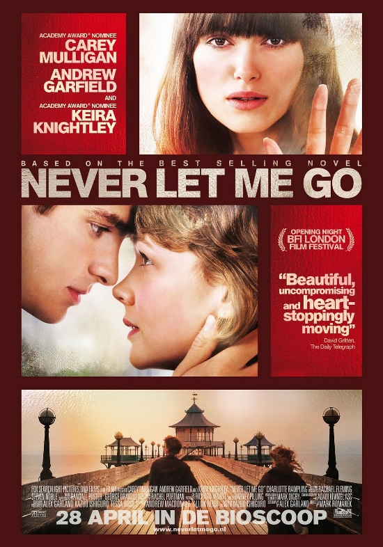
 As you can see from previous posts and my final poster, it was based on this 'Never
 i
Let Me Go' poster. I liked the layout and the idea of the separate boxes with different pictures and the difference
of close ups and mid shots used.
I liked the shade of red used in the background and tried to create a deep shade
of dark browny red with an effect of it being lighter in the middle then getting darker as it went to the edges.
No comments:
Post a Comment